About The Brand
Granunity is a premium granola product from Regal Treats, crafted for health-conscious young people between 16-38 who seek protein gains and nutritional value in their daily diet. The product blends traditional African superfoods with modern nutritional science.
Creating a Packaging That Stands Out in a Saturated Market
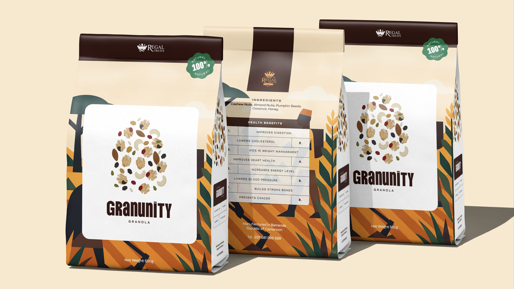
We designed a packaging solution that captures the essence of African heritage while maintaining a modern, minimalist appeal. The design needed to be memorable, timeless, and distinct enough to compete in the crowded granola market.
Key Design Principles
Minimalist Design with Vibrant Colors
African Cultural Storytelling
Product Visibility (Granola Grains Display)
Timeless Brand Architecture
How we approached this project
To make Granunity stand out in a saturated market, we focused on creating a visual identity that celebrates African heritage while appealing to health-conscious young consumers seeking authentic nutrition.
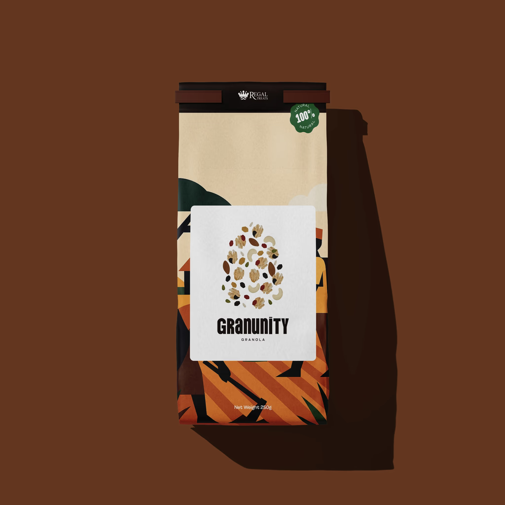
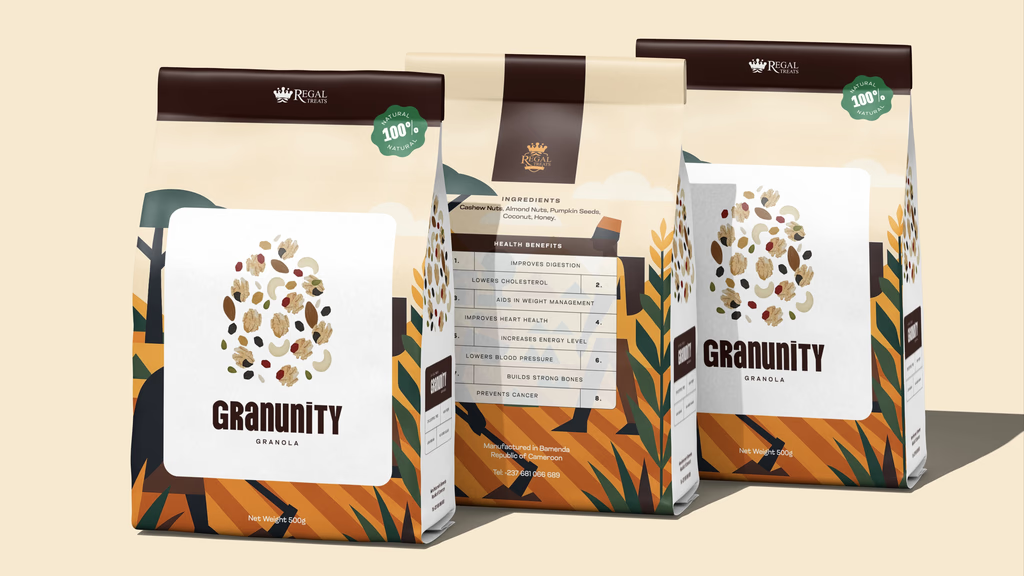
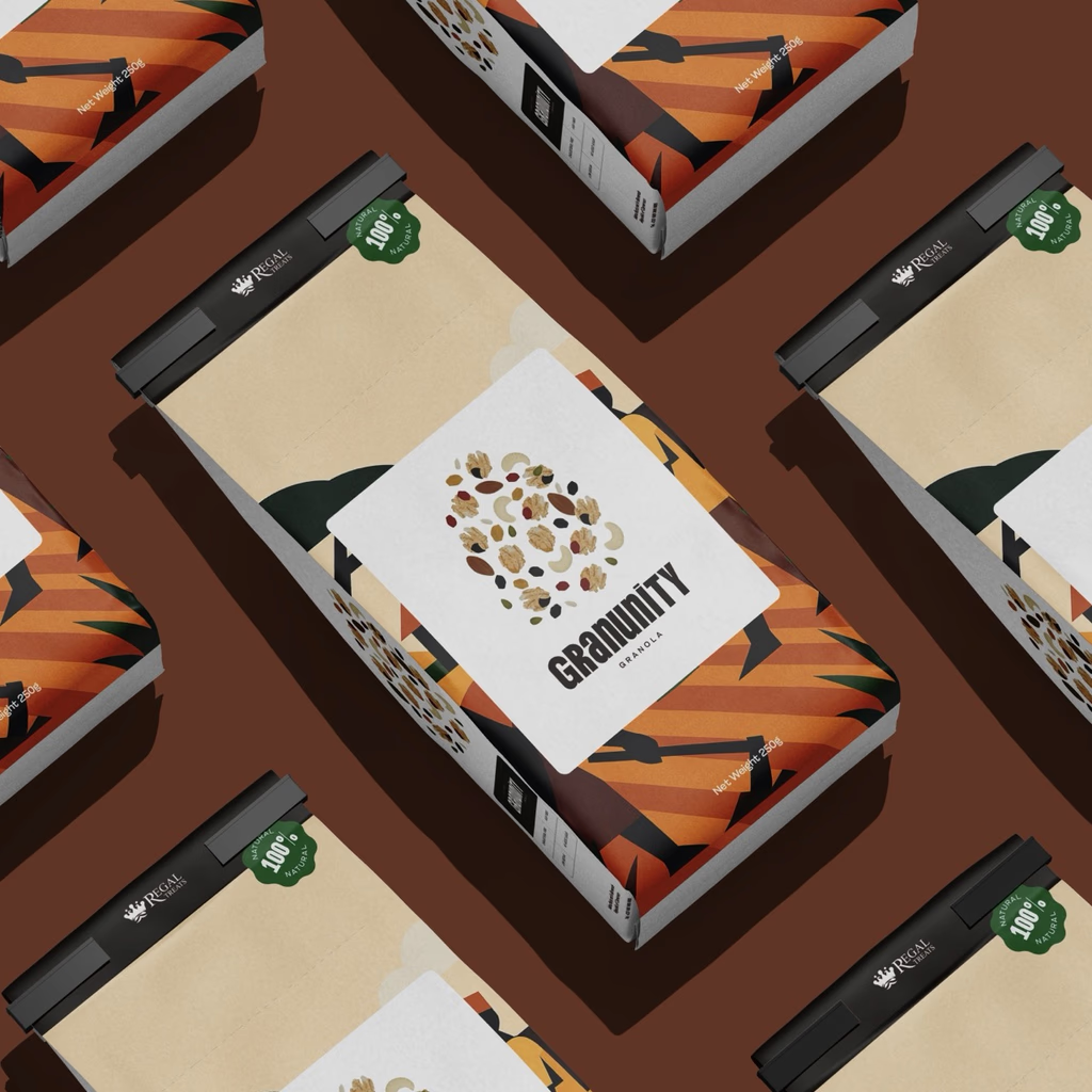
01Cultural Storytelling Through DesignWe designed a geometric African farming scene that represents the journey from farm to table. The bright, sunny color palette evokes feelings of warmth, natural goodness, and vibrant health—making the product feel both authentic and aspirational.
02Building a Timeless Visual SystemThe packaging design uses clean typography, structured layouts, and consistent brand elements that will remain relevant as Regal Treats expands their product line. This creates a cohesive brand family that grows with the business.
03Premium Positioning in a Crowded MarketBy combining vibrant colors with minimalist design principles, we positioned Granunity as a premium product that stands out on crowded shelves while maintaining the sophistication expected from a health-conscious brand.
Project Gallery
Key UX challenges and how we solved them
Designing packaging for a new granola product in a saturated market requires balancing cultural authenticity with modern appeal. Here's how we overcame key challenges for Granunity.
Standing Out in the Granola Aisle
The granola market is crowded with similar products using earth tones and rustic imagery. We solved this by introducing a vibrant, colorful African farming scene that immediately differentiates Granunity from competitors while telling a compelling origin story.
Appealing to Young, Health-Conscious Consumers
Young consumers between 16-38 are drawn to brands that feel authentic and aligned with their values. We incorporated African heritage elements that resonate with this demographic's desire for cultural connection and sustainable, natural products.
Creating a Timeless Design
Packaging needs to remain relevant as the business grows. We developed a flexible design system with clean geometric elements and a versatile color palette that can evolve with the brand while maintaining consistent brand recognition.
Communicating Product Quality Instantly
Consumers make quick decisions on shelves. We prominently displayed the granola grains on all sides of the packaging and used clear, bold typography to communicate the product's health benefits and protein content at a glance.
Tech Stacks Used

OpenAI
OpenAI helped us generate high-quality website copy, product descriptions, and marketing content that resonated with the target audience and improved conversion rates.

Illustrator
We utilized Illustrator for rapid prototyping and creating design mockups that helped us visualize layouts and iterate quickly during the early stages of the project.

Photoshop
We leveraged Photoshop to craft detailed UI elements, design responsive layouts, and create pixel-perfect visuals that ensured a seamless and consistent user experience.
How Our Design Strategies Delivered Results
By combining vibrant African storytelling with minimalist design principles, we positioned Granunity as a premium, culturally authentic granola brand that captures the attention of health-conscious young consumers.
65%
Faster shelf recognition
43%
Higher consumer recall
52%
Increased premium positioning