Client
Snap Washing Pressing
Industry
Laundry and Pressing
Year
2025
Scope of work
Tech Stack

The Brief
Snap Wash Pressing is a business that provide laundry pickup, cleaning, pressing and delivery to its customers.
About The Brand
Snap Was Pressing is a laundry servicing business which offers a 24hrs service. They also plan to deliver clients Landry within 24hrs. The idea came from the founder’s experience of doing laundry in various places. he noticed that only a few places can deliver within 24hrs. That’s what sparked the idea for him to open his own laundry shop and deliver with 24hrs.
The brand values include:
The target audience includes everyday adult people who would rather spend their free time on resting than on doing laundry.
The Problems
- The brand was looking to stand out among its competitors.
- Also since it was about to launch, it needed visuals that capture the attention of its target audience.
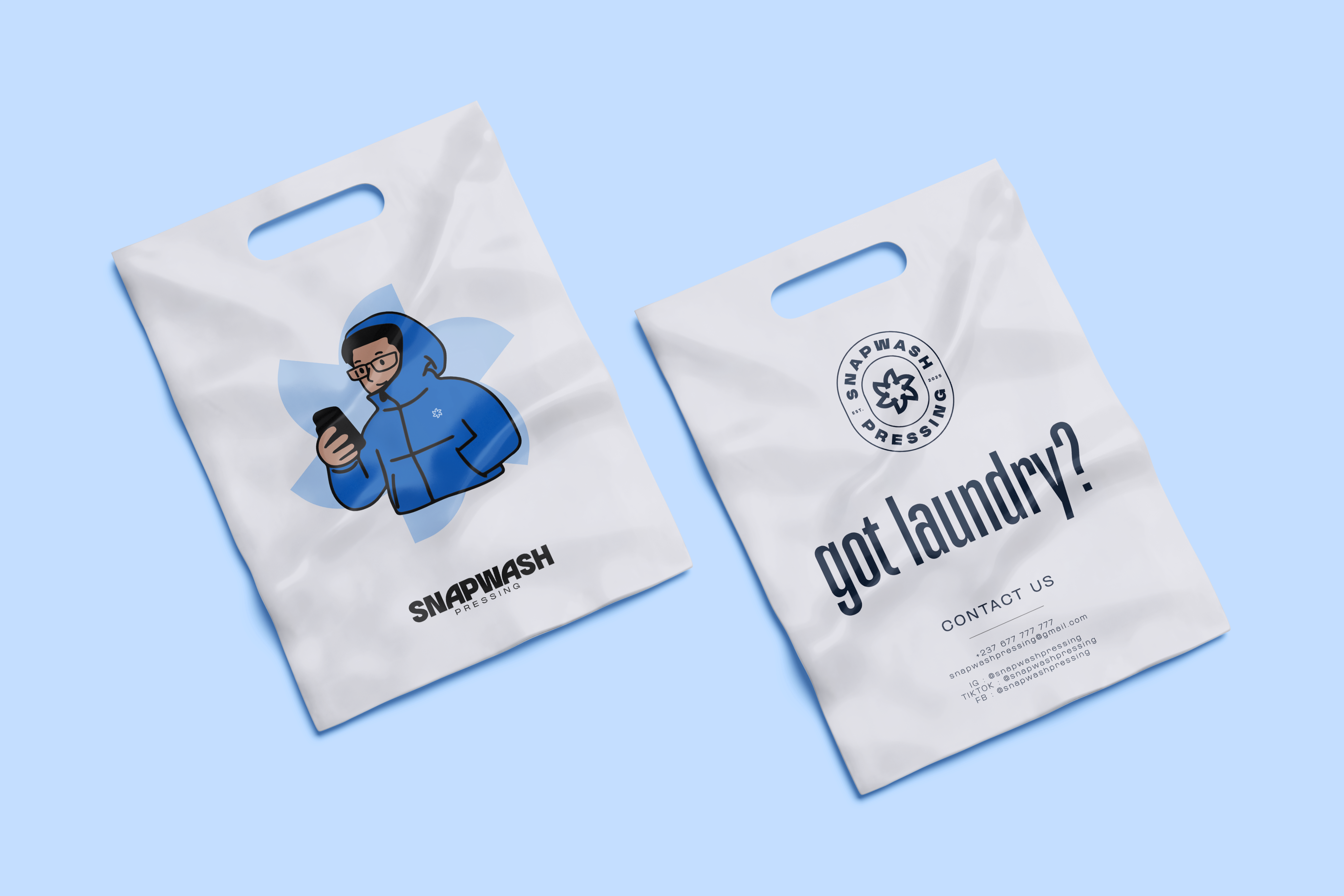
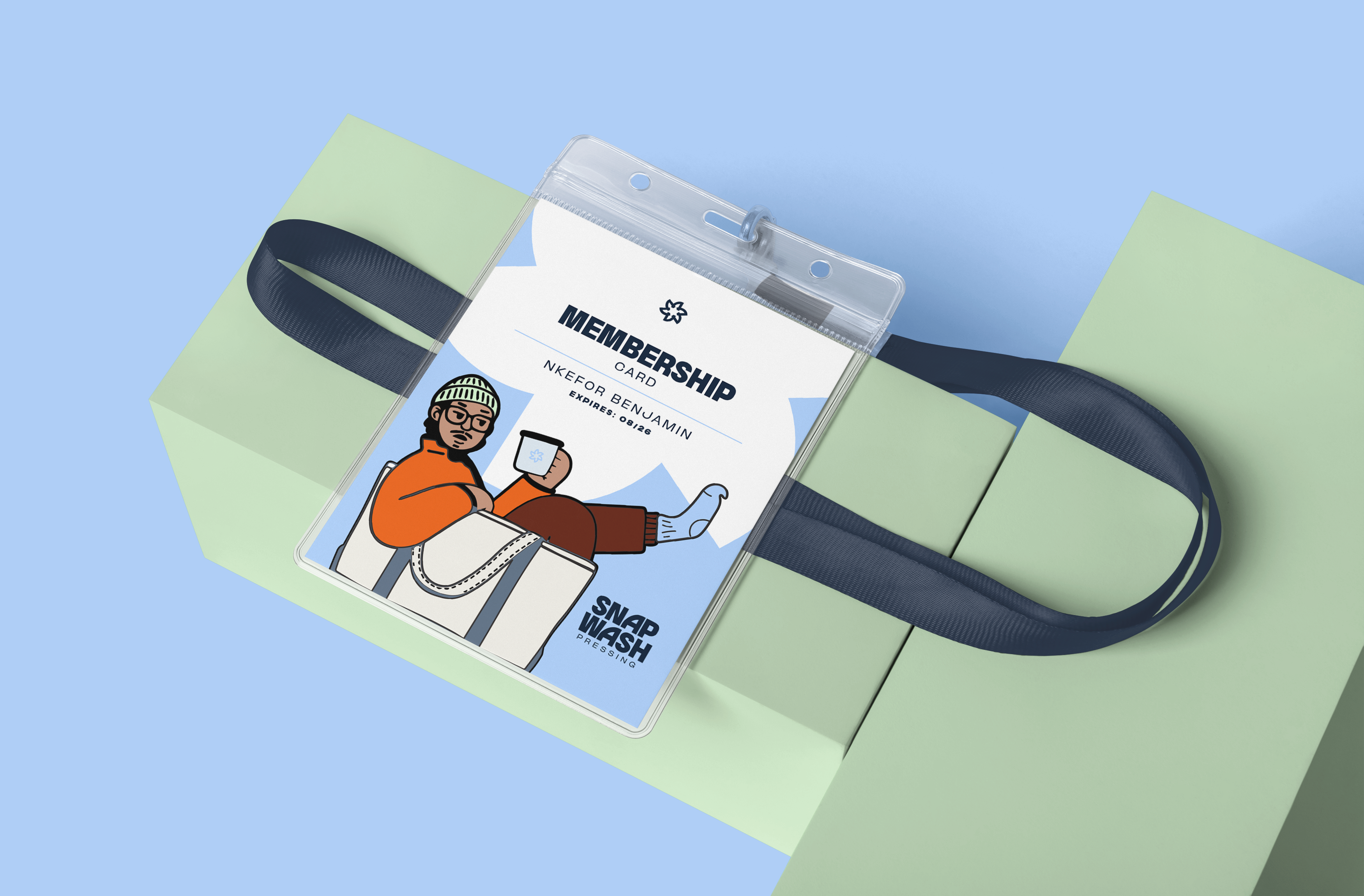
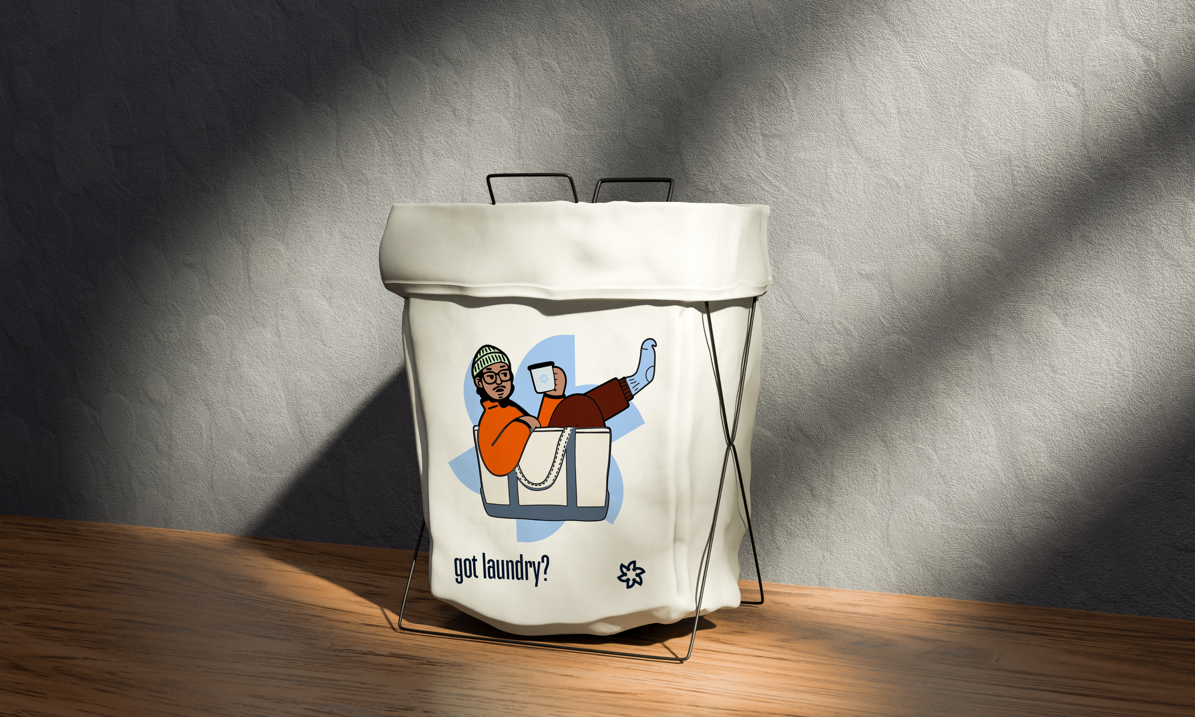
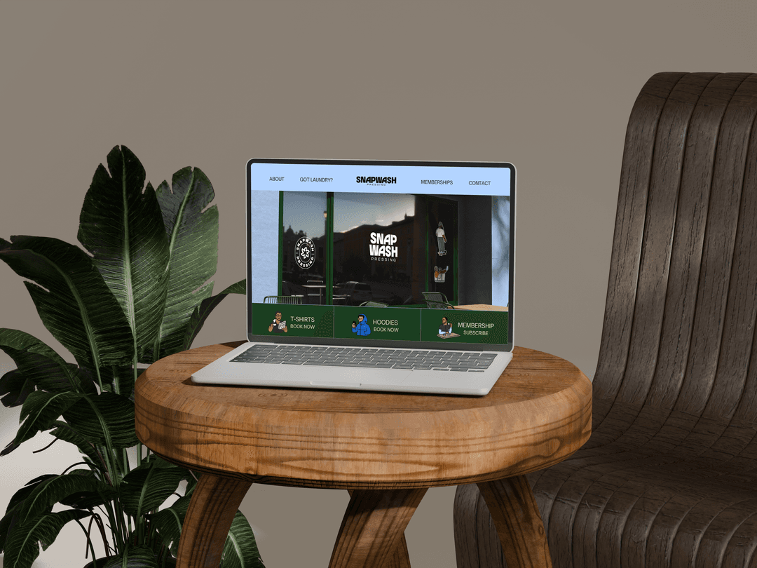
- The business also needed visuals that it can easily use to create content on social media, while keeping things consistent and visual appealing.
The Solutions
Following these problems identified at KOLA Coffee, the best solution was to craft a strategic visual Identity that remain timeless as the brand grows. The visual identity is made up of:
- A logo Suite ( 4 different logo arrangements) which can fit any size and can be scaled while being visible.
- A color Palette which shows the brand personality and makes the customers resonate more with the brand.
- A typography (font) pairing system with fonts that represent the tone of voice which the brand is speaking with.
- A Brand Pattern that can be used to give the brand visuals more character and depth.
The Findings
Before any designing was done. (after the client filled am in-depth questionnaire) a brand strategy document (containing what the brand is, who they serve, why and how they serve their mission) as well as a creative direction (containing the tone of voice and mood boards that will structure the designs ) were both created.
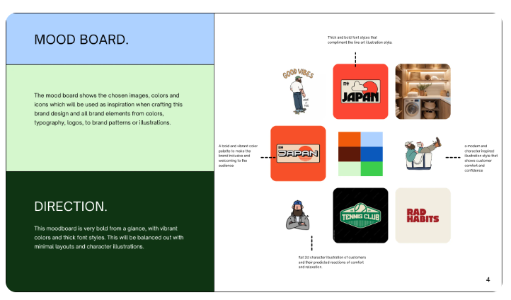
The Client went through everything, and after a strategy call, a mood board was selected which influenced the rest of the design phase.
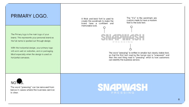
The primary logo which is a word mark was created using a clean and bold font. Then letter “As” were customized to make the brand look modern and add some elements of movement within the simple word mark.
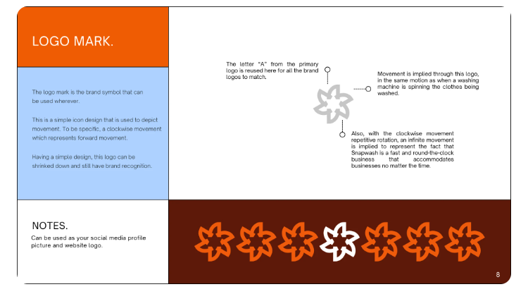
The logo mark which was created from the custom letter A from the word mark, then a rotating or spinning figure was created. First of all the A was used to keep the brand visual elements consistent. The rotating figure was created to mimic a washing machine wash cycle, as wel as to represent the day-night schedule of the business ( which runs 24 hours round the clock).
Fonts in action
The fonts style chosen includes a single font family which has fonts of condensed, Regular, and Wide. All of these can be used to make the brand more interactive but visually consistent.
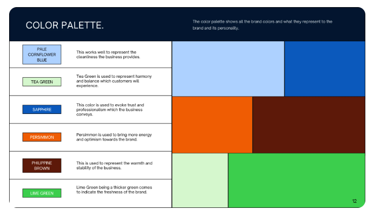
In the same way, the color palette chosen includes Bold and bright colors to make the brand look feel inclusive, while not looking like traditional laundry brands that always use only blue or green.