Client
NWCA Ltd
Industry
Coffee and Brewery
Year
2025
Scope of work
Tech Stack
The Brief
Kola Coffee is a premium coffee brand that sources high-quality beans from sustainable farms and roasts them to perfection.
About The Brand
North West Cooperative limited is a company that produces and distributes natural product like coffee under the brand-Kola Coffee. Being a cooperative, the north west cooperative specializes in natural food production. Kola Coffee is the biggest and most successful product of this business. Following the theme of the old look as seen below, keyword were used to inspire the redesign, MINIMALISM, SIMPLICITY, MATURE, NATURAL.
The brand values include:
Coffee enthusiasts and professionals who appreciate quality and sustainability.
The Problems
With their current visual identity which is made of a rugged and artistic logo with unrefined edges and angles, it is not easily scalable and can not be used on other platforms such as a website or social media while being recognisable.
Also, the tree concept leaves so much room for improvement and development into something that should be modern and time-lasting as the business scales.
The brand colors paint a good picture but leaves so much room for improvement to a color palette that shows the brand vales and personality in a way that the end customer can easily relate to.
The Solutions
Following these problems identified at KOLA Coffee, the best solution was to craft a strategic visual Identity that remain timeless as the brand grows. The visual identity is made up of:
- A logo Suite ( 4 different logo arrangements) which can fit any size and can be scaled while being visible.
- A color Palette which shows the brand personality and makes the customers resonate more with the brand.
- A typography (font) pairing system with fonts that represent the tone of voice which the brand is speaking with.
- A Brand Pattern that can be used to give the brand visuals more character and depth.
The Findings
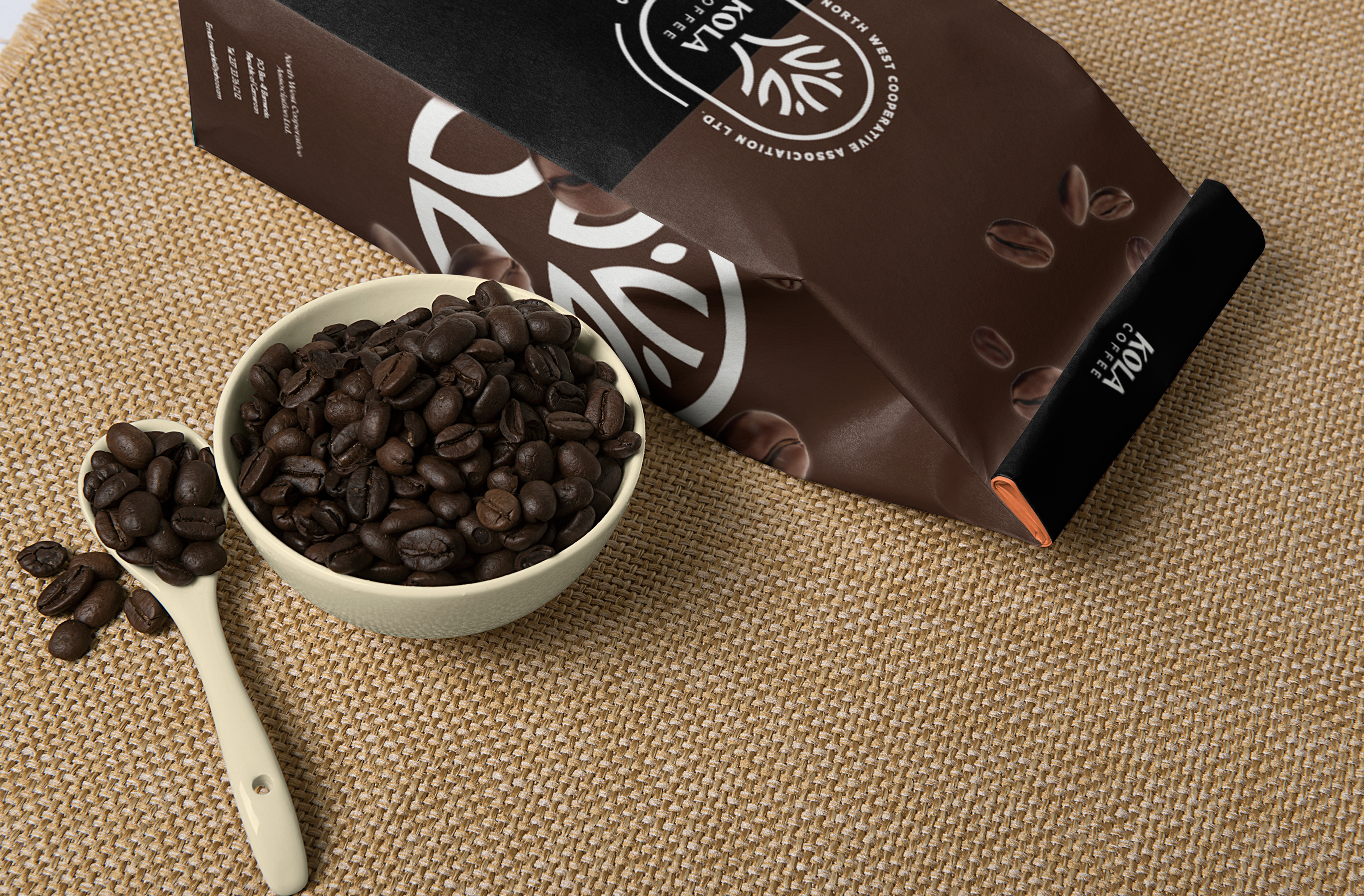
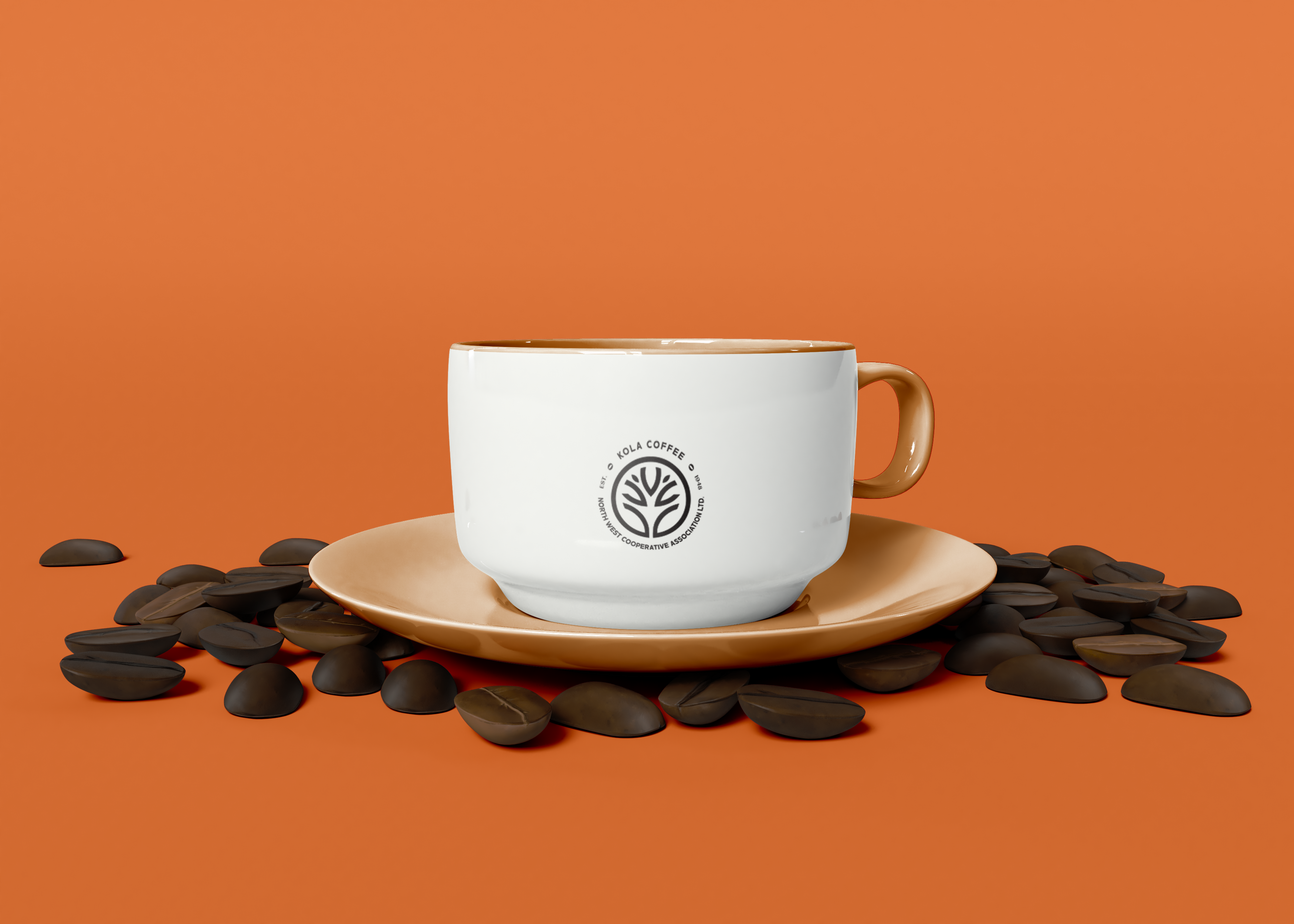
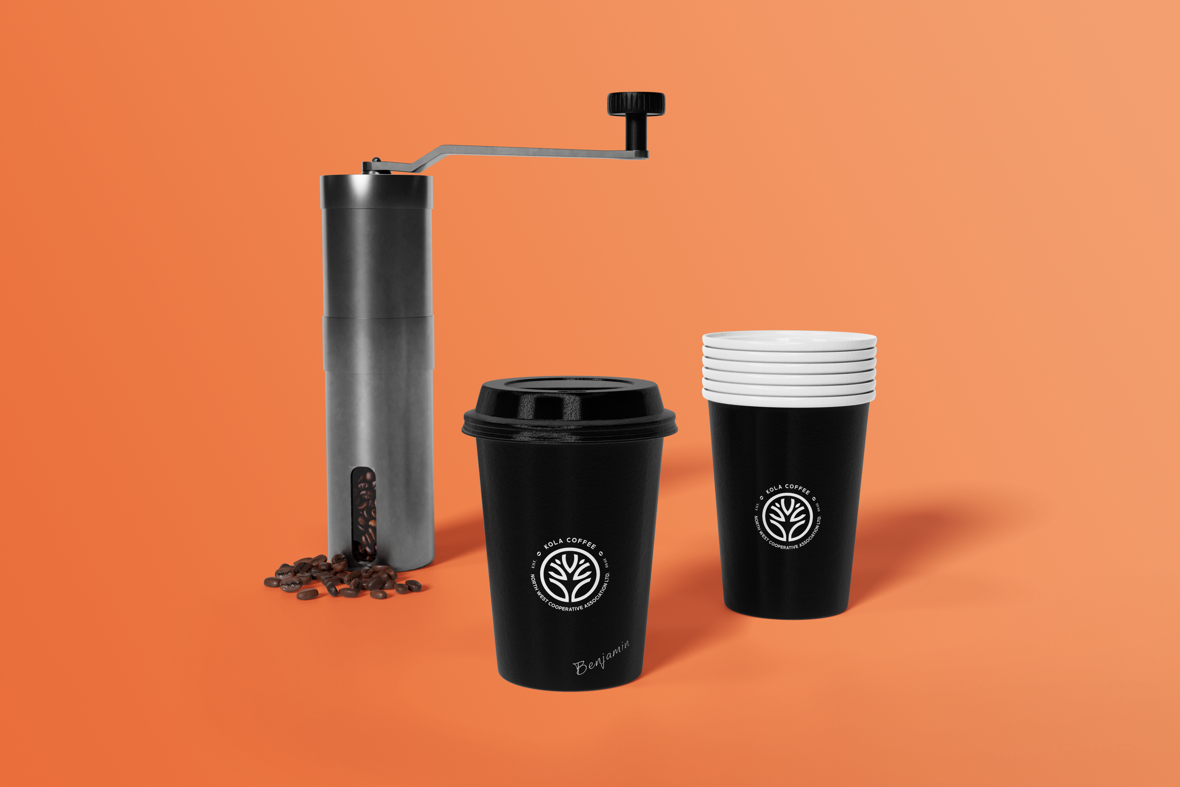
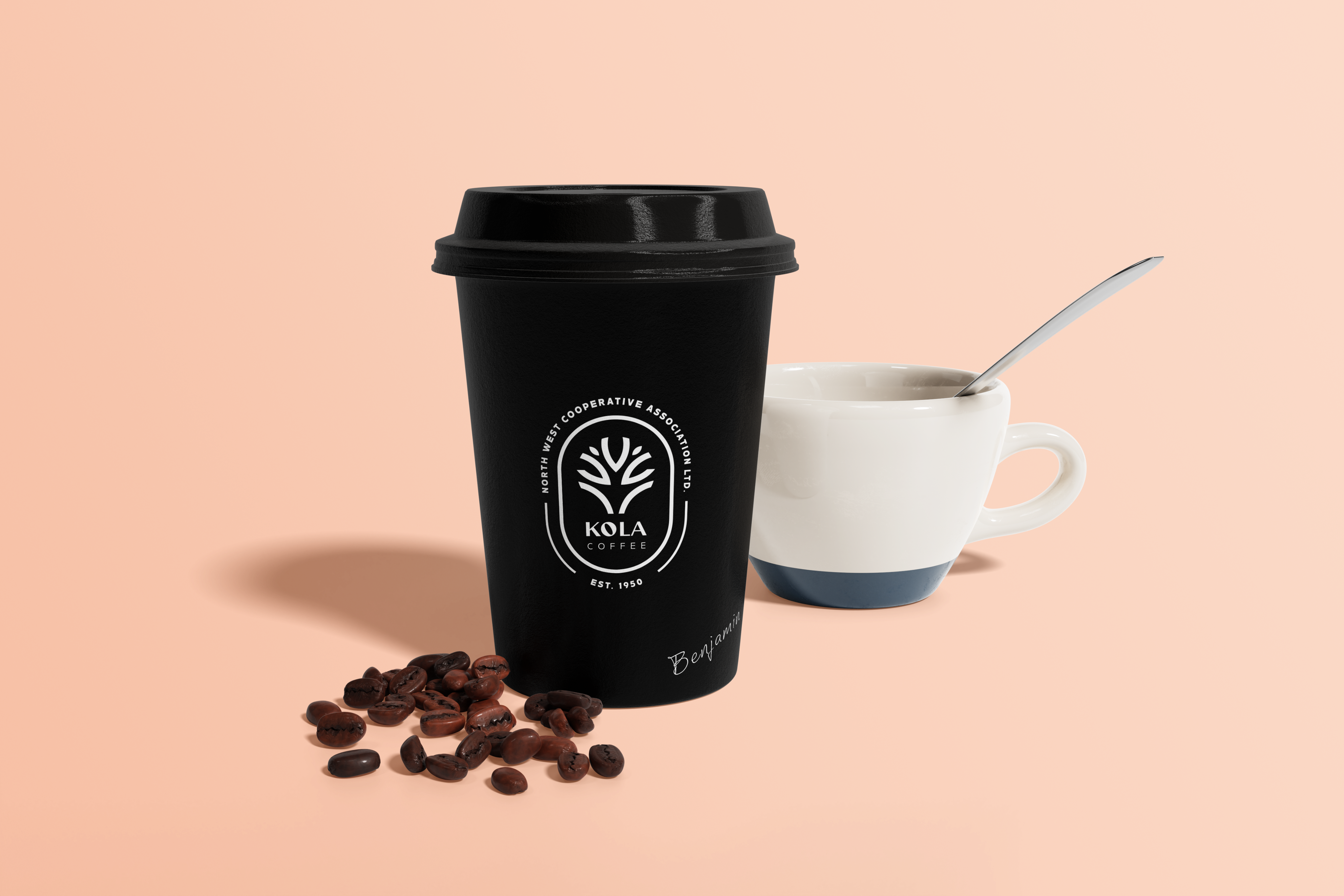
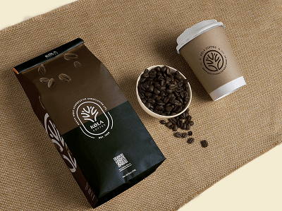
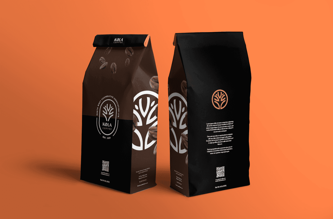
A logo mark was crafted following the already existing rugged design of trees, but with the new one created in a modern and simple design. By reusing the old elements of a tree (representing natural and growth) for the logo mark, the customers will be able to recognize the brand in an upgraded and timeless look. The logo taxt of “ Kola coffe” was designed with 2 Fonts: a luxurious font which “ Kola” is spelled in, and a simple sans serif font spelling “Coffee” These @ fonts that represent Maturity and Simplicity will be used through out the brand, for cohesiveness and consistency. For the packaging , the old design is recreated with the use of the updated visual elements and the additions of new colors in coffee Brown ) representing Coffee and Nature) as well as oragnge ) representing energy which coffee gives.